Project: Kirkwood Plumbing Logo
Objective: Tie plumbing services to the Kirkwood name so that the logo is uniquely associated with the company in this crowded field of competitors.
Solution: Make the Os in Kirkwood valve handles.

Project: Optimal FX Logo
Objective: Communicate that this is a service that helps keep computers running smoothly, with less down time.
Solution: The inner circle of the O also implies forward motion (keeping computers running) and culminates in an arrow in the negative space between the F and the X.
Project: Vision Health Care Logo
Objective: Create a new symbol for a non-profit hospital system considering a name change. “Vision” reflected their optimistic mission — but they wanted to avoid imagery that could lead the public to think of eye care.
Solution: Emphasize optimism by rendering the “V” of Vision as the sun rising.

Project: CenterPoint Technologies Logo
Objective: Visually convey that CenterPoint is a central monitoring service for alarm systems.
Solution: Use a capital C as a center point with a line entering from the left (representing notifications) and sound waves emerging from the right (representing alarms).
Project: Credit Union Membership Response Program Logo
Objective: Let credit union members know that suggestions are easy to make, and welcomed by the staff.
Solution: Demonstrate that their written comments can really speak by creating a pencil that talks.
Project: ArmorGrip Logo
Objective: Tie the name ArmorGrip to the nature of the product — a new approach to waste water sewer repair.
Solution: Render the A (for Armor) so that, when reflected in water, it becomes the G (for Grip).
Project: Correctional Medical Systems Logo
Objective: Everyone in the industry referred to Correctional Medical Systems simply as CMS. The company wanted to change their logo to reflect that convention while still communicating something about the health care nature of their business.
Solution: Integrate a medical visual into the initials by rendering the “M” as a blip on a monitor.
Project: De Smet Jesuit High School Expansion 2000 Capital Campaign Logo
Objective: Design a “rallying cry” symbol that reflects the goal of the campaign: to build a much needed addition onto the school building.
Solution: Make the “X” in expansion reflect the meaning of the word, and the goal of the campaign.

Project: In-Link Logo
Objective: Render the name of this Internet service provider so that it illustrates the company’s role in connecting users to sites.
Solution: Use the dots in the name to communicate the link.

Project: Lori K. Holcomb Dentistry Logo
Objective: Design a symbol for a general practice dentist whose name happens to begin with an “H.”
Solution: A toothbrush with toothpaste on it provided a clear visual icon for patients.
Project: Moderne Logo
Objective: Convey the classic elegance of a gallery that features high-end, vintage Art Deco furnishings.
Solution: Employ Art Deco inspired treatments for both the symbol and the logotype.
Project: Southview Homecare Logo
Objective: Render an image that can easily be identified as representing health care so that it also conveys the warmth and comfort of the patient’s own home.
Solution: Employ a ‘counted cross-stitch’ style to create a red cross.
Project: Swing Shift Logo
Objective: This was my logo during my moonlighting days. I wanted both the logo and the name to communicate to potential clients that they would be working with a creative person “after hours.”
Solution: Be creative with a clock that shows that it is after five.
Project: McGrath Logo
Objective: Convey that McGrath offers brand development services as well as copy writing services.
Solution: Use a traditional typewriter font for the logotype, then incorporate © (representing copyrighted material) and ® (representing trademarked material) into the rendering of the company name.
Project: Fertility Partners Logo
Objective: Fertility Partners provides lab services to Ob-gyns, and they wanted to emphasize the business partnership rather than feature fertility imagery.
Solution: Turn the “i”s in fertility into two people shaking hands.

Project: The Composing Room “Image It” Logo
Objective: The Composing Room wanted a promotional symbol for a direct mail series that showcased their numerous graphic output options.
Solution: Illustrate the theme line by seamlessly connecting an idea’s conception with their ability to realize it in production.
Project: Thompson Center Logo
Objective: Convey the peaceful, and refreshing nature of this Christian retreat center.
Solution: While the foliage communicates the pastoral environment, the negative space does triple duty as the trunk of the tree, a T for Thompson, and a cross for Christianity.
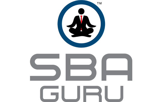
Project: SBA Guru Logo
Objective: Create a visual identity for a loan officer that specializes in Small Business Administration (SBA) loans to such an extent that he calls himself the guru.
Solution: Put a banker in a classic meditation pose.
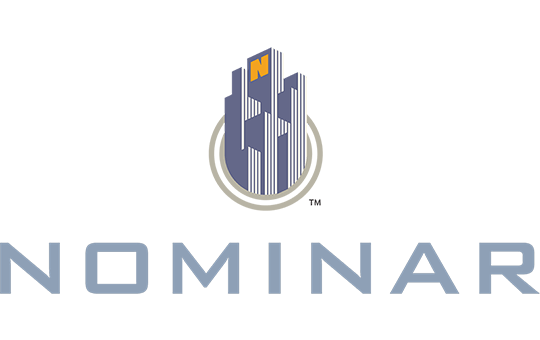
Project: Nominar Logo
Objective: Communicate that Nominar is a broker that helps property owners sell the naming rights to their buildings.
Solution: Put an “N” (for Nominar) on a building.


